Projects
Raghav Modi : the Analyst offers a range of data visualization and analysis services to help businesses gain valuable insights and make informed decisions.

Solving Real-World Business Challenges: Blinkit Sales Dashboard using Power BI
Project Overview:
In July 2024, I created an end-to-end Power BI dashboard for Blinkit, addressing business pain points related to sales performance, customer satisfaction, and outlet insights. The objective was to convert raw data into actionable insights, enabling decision-makers to optimize store operations and discover growth opportunities.
Problem Statement:
Challenges for Blinkit analysis:
-
Sales across several outlets.
-
Terms for measuring customer satisfaction.
-
How factors like store size, type, and year established affect performance.
My Solution:
Based on Blinkit’s requirements, I developed a dynamic and interactive Power BI Dashboard:
Key Features
📊 KPIs Tracked:
-
Gross Sales: ₹1.20 million – summarizing revenue.
-
Total Orders: 2,000 – monitoring order volume.
-
Average Rating: 3.9 – measuring customer satisfaction.
-
AOV: ₹141 – assessing profitability per order.
📈 Visual Insights:
-
Donut Chart: Percentage of sales by outlet size, showing how different store types performed.
-
Tables: Comprehensive breakdown of outlet types and their overall sales.
-
Line Graph: Trends in outlet performance by year of establishment.
🎛️ Interactive Filters:
Slicers for outlet type, outlet size, and item type to filter and dynamically view data.
Impact:
This dashboard enabled Blinkit’s leadership to:
-
Utilize data to make informed decisions that improve store efficiency.
-
Recognize and seize growth opportunities.
-
Analyze detailed feedback to enhance customer satisfaction.
Personal Takeaway:
This project was an enjoyable and rewarding experience, deepening my knowledge of Power BI, data visualization, and business analysis. I’m eager to use these skills to tackle future challenges and collaborate on data-driven solutions! 💡

How can Swiggy increase restaurant results and make consumer satisfaction higher over the cities more quickly?
Overview
Swiggy Sales Dashboard powered by SQL, Excel, and Power BI: I created a dynamic Power BI Sales dashboard to better reflect Swiggy’s key metrics. This project converts unprocessed information into insightful visualizations, empowering decision-makers with solutions to improve logistics, boost customer experience, and fuel strategic advancement.
🔑 Key Metrics Tracked
-
Average Order Price: Reflects revenue per order to check profitability (₹348).
-
Top Restaurants by Order Volume: Highlights top-performing restaurants, focusing on success drivers.
-
Average Customer Rating: Measures service quality and customer satisfaction (3.66).
-
Average Delivery Timing: Analyzes delivery efficiency to identify performance gaps (53 minutes).
📊 Visual Insights Delivered
-
Delivery Timing by City: Highlights cities with rapid deliveries and areas needing improvement.
-
Total Orders by City (Pie Chart): Visualizes regional order trends to inform logistics and resource planning.
-
Top 10 Restaurants: Spotlights top-performing restaurants to guide strategy and reinforce partnerships.
🚀 Outcomes Achieved
-
Enhanced Decision-Making: Enabled Swiggy’s leadership to analyze operational metrics, identify improvement areas, and uncover growth opportunities.
-
Improved Operational Efficiency: Provided insights that boosted restaurant performance and reduced delivery times across cities.
-
Enhanced Customer Satisfaction: Utilized data analytics to refine customer experiences and scale service quality.
Project Highlights
-
Date: August 2024
-
Technologies Used: SQL for data extraction, Excel for preprocessing, Power BI for advanced visualizations.
-
Core Deliverables:
-
A real-time interactive dashboard monitoring KPIs.
-
Insights to optimize restaurant operations and city-specific delivery strategies.
-
Visuals supporting data-driven decision-making.
-

How Can Adventure Works Bike Store Optimize Sales, Understand Customer Behavior, and Drive Growth Across Regions?
Using SQL, Excel, and Power BI, I built an advanced Power BI dashboard to transform raw data into actionable insights, enabling businesses to understand key metrics, customer behaviors, and market trends for data-driven decision-making.
Key Features:
Sales Metrics
-
Metrics Tracked: Total Revenue, Profit, Orders, and Returns Rate.
Visualizations:
-
Trend for Monthly Revenue and Orders by Product Categories (Accessories, Bikes, Clothing).
-
The top 10 products, the most ordered, the most returned products.
Geographical Insights
-
Map Visualizations: Sales and returns by region.
-
Insights: Key areas performing well and those needing improvement.
Performance vs. Targets
-
Monthly Performance vs. Target: Orders, Revenue, Profit.
-
Methodology: Compute price changes and their impact on Profit and Revenue.
-
In-depth product-level summaries for testing.
Customer Insights
-
Metrics: Unique Customers, Revenue per Customer, Income Level & Occupation Orders.
-
Summary: Whether they are orders or contributions to revenue, analysis of Top 100 customers.
Q&A Section
-
An interactive tool that allows you to query the dashboard for instantaneous insight generation.
Decomposition Tree
-
Interactive analysis to drill down on key drivers behind metrics like Total Orders, etc.
Key Outcomes:
-
Strategic and Growth Insights: Easier monitoring of KPIs and prospects of growth.
-
Based on Data: Data-focused intelligence created from sales trends, customer habits, and local metrics.
-
Operational Efficiency: Improved alignment of strategy across products and regions.
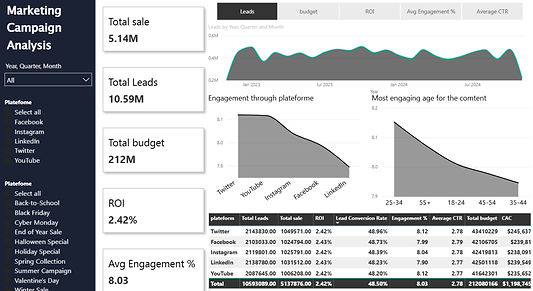
How Can Brands Supercharge Social Media ROI, Maximize Engagement, and Optimize Campaign Performance Across Platforms?
While I previously worked on a data-heavy project improving social media campaign strategies via analytics, having a strong performance and ROI focus. Here's how raw data became actionable insights:
📊 Key Insights
Overall Campaign Metrics
-
Total Sales: ₹5.14M
-
Total Leads: 10.59M
-
Total Budget: ₹212M
-
ROI: 2.42%
-
Average Engagement: 8.03%
Engagement Analysis
By Platform:
-
The Winners: Twitter and YouTube did well for engagement and ROI.
-
Underperformer: Lowest Engagement — LinkedIn.
By Content Type:
-
Top Formats: Engagement was led by videos followed by stories.
-
Least Effective: Carousels.
Cost Effectiveness & Conversion Rates
-
Lead Conversion Rate: 48.50%
-
Customer Acquisition Cost (CAC): Twitter was the least CAC-intensive platform for converting leads to sales.
Audience Demographics
-
ROI was similar across rural and urban audiences (>20% each).
-
Campaigns for male demographics were marginally higher in ROI (2.44% vs. 2.38%).
Campaign Highlights
-
Top Campaigns: “Halloween Special” and “Spring Collection” topped total sales.
-
Platform Impact: Twitter generated the most sales overall.
🎯 Key Recommendations
Platform Strategy
-
Focus on Twitter and YouTube for better engagement and ROI.
-
Shift resources away from LinkedIn to the best-performing platforms.
Content Optimization
-
Leverage video content first and use stories more for better engagement.
Demographic Targeting
-
Give a little more priority to males to improve the return on investment.
-
Keep outreach balanced with rural and urban.
Budget Allocation
-
Take advantage of Twitter’s low CAC to convert cost-effectively.
📈 Results & Takeaway
This project also found that data-driven strategies are optimizing engagement, conversion to leads, and ROI. Rather than making decisions based purely on gut-feel, brands can build campaigns based on results and evidence — from actionable insights.

How Can Company Enhance Customer Insights, Improve Order Management, and Optimize Delivery Efficiency Using Data Analytics?
Project Overview
A data-driven initiative was implemented to optimize operations across several areas, including customer insights, order management, product performance, payment analysis, and delivery optimization. By transforming raw data into actionable insights, the project achieved notable improvements in efficiency and satisfaction.
Key Insights
Operational Metrics
-
Total Sales: $120M
-
Total Orders: 1.8M
-
Customer Retention Rate: 85%
-
Average Order Fulfillment Time: 45.38 days
-
Return Rate: 30.15%
-
Failed Payments: 33.85%
Customer Insights
-
The top 3 customers contribute 15% of total revenue.
-
Seniors (50+) are high-value customers, with 60% of the base being female.
-
The churn rate is low (0.86%), but male customer retention can improve.
Order Management
-
24.68% of orders experience shipping delays, mainly in Home and Clothing categories.
-
The return rate is 30.15%, particularly in Home and Clothing products.
-
Beauty products generate significant revenue ($40M+), especially makeup and fragrance.
Payment Analysis
-
33.85% of transactions fail, primarily due to issues with bank transfers and credit cards.
-
32% of payments remain pending, negatively affecting cash flow.
Delivery Optimization
-
Average delivery time is 45.38 days, exceeding industry benchmarks.
-
Delivery delays are concentrated in specific regions.
Key Recommendations
Customer Insights
-
Introduce loyalty programs for senior customers to increase retention.
-
Develop marketing campaigns tailored to female customers.
-
Use predictive analytics to target male customers at risk of churn.
Order Management
-
Utilize predictive analytics to mitigate shipping delays.
-
Investigate and address return drivers in Home and Clothing categories.
Product Performance
-
Focus on promoting top-performing Beauty products.
-
Reevaluate discount strategies to ensure profitability.
Payment Analysis
-
Partner with payment providers to lower transaction failure rates.
-
Provide alternative payment methods to reduce pending payments.
Delivery Optimization
-
Address regional bottlenecks to improve delivery times.
-
Use machine learning to enhance delivery time predictions.
Results & Takeaway
The project demonstrated measurable improvements in customer retention, order fulfillment, and payment processing efficiency. The insights gained emphasize the importance of data-driven strategies in achieving operational excellence and fostering business growth.
Key Takeaway
Leveraging actionable insights from data is crucial for streamlining operations and enhancing customer satisfaction, resulting in sustained business success.
Unlocking Business Potential with Data
This website is a Business Analyst portfolio aiming to showcase data visualization projects and other certifications. It's a platform to explore the power of data in driving business decisions and strategies.
Empowering Businesses with Data
Raghav Modi : the Analyst's toolkit is designed to empower businesses with the tools and techniques needed to harness the full potential of their data.
All-In-One Analytics Toolkit
Seamless Data Sharing
Customized Visualizations
Skills
"Write a list of technical tools I use for my work."


